Building a Website from Initial Client Meeting to Final Launch with W&CO’s Vijay Mathews
In this episode Gary Rozanc reflects on what he has learned from hosting the Design Edu Today podcast on its two-year anniversary by revealing his top five takeaways. Gary also discusses the upcoming hiatus so he can redesign the show's website.

Vijay Mathews who cofounded W&CO. in 2011. Noticing a trend towards mobile applications, Vijay jumped on board and learned quickly the value of a digital presence. For over five years, Vijay Mathews has designed and developed dozens of applications, and has consulted with a wide variety of clients regarding digital strategy, design, and implementation including AIGA, the City of Newark, Harvard University, the Four Seasons, Samsung, and Wolff Olins.
His work has been published in Design on Screen (expected Oct 2016) published by Sandu, the fourth edition of Designing Brand Identity by Alina Wheeler, Numbers in Graphic Design by Roger Fawcett-Tang, the fifth edition of Graphic Design Solutions by Robin Landa. and the second edition of Signage and Wayfinding Design by Chris Calori and David Vanden-Eynden. Additionally Vijay has spoken at the national conference at SEGD, the Fashion Institute of Technology, the International Sign Association conference the Digital Signage Expo, and for the Print Magazine Design Series.
Prior to founding W&CO., Vijay worked as a Senior Designer at Two Twelve, an environmental graphic design firm in New York. Before that, he was an associate designer at WGBH, PBS’s largest producer of web and television content, where he created a variety of print materials for television programs. He also worked as a print designer for Hatch Show Print, a respected letterpress print shop of music and event posters in Nashville, Tennessee.
Episode Links
Abridged Transcript
- Gary
- The reason I’m having you here is, when it comes to designing a print piece, I think all design educators know the print process; however, most of us who teach interactive design probably are self-taught and came from a print background and therefore are teaching students interactive design based on a print design process, even though the two, I think, are very different. Since you just created the website for the AIGA National Conference, I want to chat with you about the entire process for creating that, from initial client meeting to the site actually going live. So, my first question is, was the website design and development a typical job and a typical client you’d normally work with?
- Vijay
- Yeah. It’s interesting; we’ve been working with AIGA since we formed our company back in 2011. They were our first client and they helped us frame the kind of projects we like working with and the kind of people we like being a part of. They are a kind of organization that value design and the people who value your opinion, but that relationship really took a lot of time to build. When we started working with them it was around the same time that they started pursuing a stronger digital presence. We had just formed our company and we too were embarking on the role of transitioning from our typical print process to more of an interactive process and so in many ways, we were embarking on this transformation together and figuring out a lot of things along the way in terms of what it means to have a digital presence; what it means to have a content strategy; understanding your audience. So that relationship was kind of forged over the years and put us in an interesting position in terms of how we work with them, mainly because we no longer really have a truly rigid formal process when it comes to taking on these projects. It’s far more fluid because we’re so familiar with their challenges and what they’re trying to achieve and that mindset actually is pretty common these days. I’m sure you hear of these stories now of these larger institutions just buying out the small independent agencies because they have such a strong relationship with them and because they understand the voice of the company and the vision of the company. But yeah, getting back to your initial question, they are definitely now a typical client we work with and pretty much a very typical client, I’m sorry, project, because it requires both design and development.
- Gary
- You said something interesting there that I didn’t really ever think about before. So is that actually happening, where, I don’t know, in the start-up field, bigger companies are buying up smaller companies so they don’t have to re-invent the wheel. Is that actually happening to firms?
- Vijay
- It does actually, yeah it is; it’s interesting. Maybe the more relevant one that you’ve heard about recently was Facebook bought out Hot Studio. It was a company founded by Maria Giudice and they just got bought out because they had been working with them for so long, Facebook recognized the value of that company’s perspective on how to bring themselves to a new position in the market-place. A lot of companies don’t necessarily invest in the in-house design team from the get-go; they just farm it out and then the in-house team eventually gets built out, oftentimes with the support of that third party agency and in some cases, they just get bought out entirely just because it makes it a little bit easier to build that capability in-house.
- Gary
- OK, I’ve never really heard of that before: wow, I’m glad to get to learn about that. All right, but back onto this idea of the design process. Based on it’s a client, so did the AIGA contact you or did you get in touch with them?
- Vijay
- It’s almost like a two-fold. For this conference website, and again this was really because we’d been working with them for so long, they literally sent me a G-chat message saying hey, the Conference is gearing up, FYI and I chatted back saying, cool, keep me posted. And of course there was the follow-up email saying hey, can you come in and we’ll discuss about this a little bit more formally. So in that regard, it was a very informal kind of start of the project, but that being said, I think some context will help to show the relevance of that relationship. When we were first brought on board to start developing the Conference, or additional properties for the Conference, that was back in 2011. We were asked to create an iPhone application for that Conference. In many ways, it was really for AIGA to test the waters to see, would an app be relevant for this audience, for this community of attendees at this venue? We didn’t know; it was 2011 and bear in mind the iPhone had only really been around for about three year so it was very much brand new and in that regard, that process was very formal: AIGA reached out to us because we had already worked on a project so they short-listed us. They provided us a brief, a very formal brief listing out the goals, the requirements, the general background of the Conference itself for this year, or for that year, I’m sorry, by a list of assets including Conference fonts, color palette, image assets, as well as their own brand guidelines so we were fully aware of how they needed to be presented within this digital application, as well as just general reference materials from the Conference’s past. They had been doing the Conference about twenty years and so they had a certain way of doing it in a traditional sense and to that point also, up until 2011, all the assets generated for the Conference were very print based: long form of schedules, booklets, things that had been meticulously crafted by various design studios every year for the Conference: beautiful, beautiful specimens if you will.
- So the app was very much an experiment and so when we pitched the job, by a budget, a timeline and they agreed to those terms and we began work. And so we crafted the app and it was a very, very quick timeline; we had about four weeks to do it at that time and we were just trying things. We were just trying to do the most we could do within the timeframe that we had to make sure that it could meet the requirements that AIGA had at that time. And so we released it and what turned out to be is that it was wildly loved and accepted by the audience, for one very simple reason: it was the most relevant, up to date piece of information they had at the conference so again, looking at the print world, all those specimens were designed and crafted months prior to the conference; they just had to be so they could get printed and shipped to the venue on time, but that being said, you have a Conference that is constantly in flux; speakers are changing, locations are changing, maybe even the events are changing pretty much the day of the conference, so you needed to create a system that will allow it to be updated and that’s where the app really because a shining example of that medium because it could stay up to date. It was constantly pulling in new information as events were changing and it became the go-to standard for the latest and greatest information at the Conference. And so, it became also another thing. Because people had their phone on them at all times, they valued having just a singular application that housed all that printed content. Again, bear in mind, you have a pretty big booklet of information that you’re being provided and that’s pretty thick: you don’t want to walk around town with that thing but you’re already walking round with your phone and you have basically this app that has the exact information becomes far more convenient.
- So, this really paved the way for the AIGA and how they were pursuing these digital applications and it really transformed from this novel tchotchke to kind of a utility for the Conference. So that kind of set a precedent for how to move forward with the Conference in the coming years and then come year 2012, we pursued an iPad app as well and that didn’t really go over too well, even though iPads were really becoming part of the marketplace at the time, it didn’t resonate with the audience and that was a learning process: what works, what doesn’t work and we realized that was a great experiment to craft an iPad app alongside the iPhone app, but it just didn’t have the same numbers or didn’t resonate with the audience the same way so the following year we ditched it, but what we did place, this is now 2013, we were tasked to create a website alongside the app. Up until that point, they were using their events system that handles all registration but as the Conferences were getting a little bit more robust and complex, they wanted to create a website that could also capture the same depth of information in a very structured way and so that was the first year where we started looking at this conference application, not so much as a one-off but more as a platform. We started looking at the relationship between these two devices because they are in many ways wildly different in terms of interface, in terms of content, in terms of general usability; you’re talking about a stationary application that you experience at home, maybe in a hotel room, on a computer as opposed to mobile application that you’re using on the go, but at the same time you had to start looking at it in terms of how they relate to each other and that was an interesting kind of experiment because we didn’t know, we weren’t necessarily sure; we had a good idea of some of the content that we were dealing with but now, building a platform that could work together was something that was brand new for us. And so that was, again, in iterative experiment; let’s get it out there, let’s start examining the content types, let’s start planning out information hierarchy that connects the two and see how it works and it was great, it worked out pretty well. We definitely made a few mistakes in terms of how to organize content but that’s part of the process is figuring out what works and what doesn’t work. And so, skip a year, but looking at last year, we took everything that we had learned and developed the last couple of years and really transformed it again in a kind of painful way. Basically because we had to start over from scratch. And here’s the thing with technology and something that is a pain; I think printed materials, there is a very formal process in terms of the tools at your disposal and what you’re trying to achieve. With technology, it’s ever-evolving in terms of how you actually build things out, from just the user interface, to how you actually program things, and last year a new framework was released that changed the stage, if you will, and it’s a framework called React that was crafted by Facebook and basically we re-examined this thing and it looked like the future in terms of performance, sustainability and just compatibility.
- I think one thing that you realize as a practitioner as well as a student is that you’re not just looking at one format; you’re looking at multiple formats. You’re looking at web, you’re looking at Android devices, iPhone devices, kiosks and so on and so forth and you have to have this flexibility in terms of how you design as well as how you program, it’s a duality, if you will. And that’s something that you’re always trying to figure out: how do you do it the most efficiently? You can’t just spend your entire life doing a project because you just don’t have that kind of amount of time to work on because there is typically an impending deadline so you have to be smart about it and so ??? framework allowed us to recognize the value of a nice balance between the amount of time needed versus what could be outputted. But that required re-investing and re-building from scratch. And so that’s the thing, so we are looking at success of scalability and for us it’s really a learning process. It’s about trying things, about listening to others and parsing feedback. For this project, we didn’t do any user testing prior to the release of the project. We actually used the Conference itself as our user test and we would take those findings and apply it to the following year. So this project is never done, it keeps on being iterated upon and improved in terms of usability and performance, so for us, the success of the project is really about invisibility; this idea that people now just expect it, they go onto iTunes or Google Play store and expect to see that app to go prior to the Conference and downloading it and when no one really says anything about it, but you see them using it, that’s a really good feeling because you know it worked and that’s…we’re always aware of that.
- Gary
- So, just letting the listeners know that, in the future, I’m going to be talking with you about when it’s a brand new relationship with a client, how do you…we’ll talk in the future about how do you set yourself up for that success and that future scalability and how do you research all that out when it’s a brand new client. But…you’ve had all this organic research that you’ve done and that you’ve built up from this existing relationship. Once you kind of figured out that they needed a website and they needed an app, what did you do next? What was the next process once you figured out what they needed, and it sounds like you also already had most of the content and even some branding guidelines and assets to start with?
- Vijay
- Yeah, again, because this project is more of an iteration of what we’ve done in the past, there were basically essentially two tracks of work this year and actually a little bit more development-heavy because we’re including an Android app this year, because we didn’t make one last year, we knew it had to be built, so while the design team was working on this year’s user interface for the website, the development team was actually just working on porting last year’s design functionality of the iPhone app to a native Android app, so then when the dev team was working on implementing the website design, the design team was now working on updating the design of the app and now we’ve just got sign-off on the design of the app so the dev team will be working on implementing their design on the iPhone and Android and because the functionality’s pretty much squared away now, because the dev team was working on that while the design team was working on the user interface, it’s really now more about just implementing this brand new skin on the app, so the Conference has definitely a lot of moving but expected pieces, which makes it a lot easier to delegate and stagger the process for just the sake of efficiency. And here’s the other thing: unlike a lot of projects, this Conference has a very set, hard date, so with a lot of projects, there is always this wiggle-room; when does the thing really need to launch? When does it need to be internally released versus public released? This thing needs to be fully baked with an ample amount of time for users to experience and download it, so we have to move very quickly on a lot of these pieces and so that requires just assigning roles to people and having them just do the work.
- Gary
- And now you’ve got two sets of…well, I’m assuming you have three sets of developers: ones that are doing the web, ones that are doing the iOS and ones that are doing the Android, and how are designers working to keep the branding consistency and design consistency across all three? How do you manage that?
- Vijay
- It’s a lot of…a little bit of juggling and actually prefaced by saying, this year’s identity was developed by Mother New York, so they had already established typefaces, they had established a color palette, so that really set kind of the basic elements of what we had to work with, but that being said, we really had to translate that very basic information into a much more interactive piece which is where the hard work comes in from design and development perspective, for web and iPhone. So, the teams, yes, we kind of bucket them to two groups: design and then development. The designers, typically interactive designer, information architect, content strategist, not so much this time around. It’s really more about just visual designers. And then development, we had two developers on it full time working on these various assets and we really only needed two because again, it was an iterative approach from last year; there’s more about making these various tweaks and updates in their staggered approach. And so, when it comes to the design, it’s really examining the assets that we have at hand and just going through a traditional approach of establishing your various page templates, taking the elements that are in place established by the identity team and making sure that there is this consistency, at least from a web perspective. We didn’t look at the iPhone until the website was pretty much established because we knew that from a time-wise perspective, it wasn’t the most pressing. It’s their initial portal for getting the word out that the Conference is happening and it’s their singular portal for getting registrations for the Conference, so that was our focus, getting that thing fully baked before we even started looking at the iPhone. When that was fully approved in terms of the general esthetic, and that was a very iterative approach, going back and forth, figuring out how to make sure that there was this consistency between what was happening in the print version of it as well as the digital, or at least a happy medium, then we started looking at the iPhone and that was really more of a trickle down relationship from the rules that were established on the website, so then it was just more about making sure the iPhone pretty much shared the same values that were established on the website so it was a much easier process. Sorry, what?
- Gary
- No, no, another…something you mentioned earlier back that I didn’t…I was aware of but I didn’t fully realize it until you just said it and I think this is important in the classroom and it was, you said another firm did the original identity, and I think that’s really important because that’s the way the industry works: it’s not always you’re a one-stop shop and clients…you have to collaborate with other people to fill each others’ needs, so students I kinda think have to need to get used to working that way, but in design school, we always, at least I do, kinda start of with: you’re the content generators; you’re developing the identity; you’re creating all this stuff; but I’ve never actually given the exercise of…here’s the visual identity: go make it work and stick to the original brand. Is there a….
- Vijay
- Yeah, I mean, that’s a very astute observation because that’s the reality in which we typically work. Again, we’re an interactive company. Our priority is taking these elements and basically creating a container for it, but we don’t do it in a silo: we work with our client who typically is responsible for the content and then we work with the branding agency who is typically responsible for the identity, so it is a very collaborative approach in terms of figuring out how all these moving pieces can work together to create that cohesive family. The idea of a one-stop-shop, I don’t know is as relevant as maybe it once was because now you have companies that are specializing in various services and they become kind of experts in that domain. But it also allows for a greater collaboration in terms of what can happen because all of a sudden, you’re working with people who are experts in a different field and you’re learning so much from them because they provide a different perspective, a unique perspective that’s foreign…not necessarily foreign, but not common in your practice and that allows for great conversation, great dialogue in terms of what this thing can be. I think this value of diversity in opinion and perspective, and a lot of that comes from outside; it comes from a greater solution at the end when you have these different perspectives.
- That all being said, yeah, for us, it’s managing a lot of those pieces so again, from the branding perspective, it’s working with them, understanding what is their intent with this identity, and how can it translate from that more printed vision to this interactive vision and it looks like OK, where’s the flexibility? How can we push it? How can we add a layer of motion and interactivity in terms of how people click on things, how people respond to things, how do you see transitions? So it’s really about expanding that baseline design language to allow for a greater interactivity and then from a content perspective, AIGA’s responsible for that, it’s more about how do you craft an interactive solution that takes all the pertinent information and puts it in a way that makes it accessible? Again, we’re not talking about developing a book; we’re creating these pages on a screen that require a lot of scrolling, so you want to have this very concise messaging; you want to have a clear structure of information in terms of hierarchy because people don’t necessarily have the patience…well, not necessarily patience, but don’t necessarily have the time to view pages and pages of information. They need things that are easily accessible so that they can make those decisions or become more informed about what they’re looking for.
- Gary
- From an educational standpoint, what can I do in the classroom to help…OK, Brad Frost, Atomic Design and Pattern Lab; he did a style guide podcast, a short run of them, and everybody’s talking about style guides, and I always thought of style guides as like a branding guide but I never really truly, until you just said this, thought about the importance of so much is handed off nowadays and not just handled by one person, so, from a…what should we be doing in the classroom to have students better documenting what they have so it is something they can hand off? Does that make sense?
- Vijay
- Yeah, yeah; it’s interesting because there are definitely these two approaches in the real world outside of classroom about how you build things out: do you do everything in-house or do you farm it out? There’s just two ways of doing things based on capabilities. Now, from a classroom perspective, I think the documentation part is a very interesting real-world example because I think that’s something that is missing when it comes to translating your intent to having it be implemented and what we’ve realized is the importance of just providing clear documentation in terms of a design language, so you’ve got to look at the web as, or even any…I use the web in a very general sense, but anything kind of interactive, about creating a design system and there needs to be rules that govern this system. It’s no different than creating a set of brand guidelines for identity. There are ways of doing things based on pixel widths; based on type size usages; based on general placement; dos and don’ts if you will. What that starts doing is starts creating this toolkit, if you will, of how something could be implemented and extended across permutations that you didn’t foresee. Again, just like brand guidelines, but those are through rules that have been established, like you always include a hundred pixel padding between these two elements: that’s just a rule. And once you start doing that, you can easily extend it to new page types or new models that haven’t been established but have the flexibility because you’ve established a lot of these baseline rules that govern such new features. So, from a documentation perspective, oftentimes it’s about line item things like in terms of dimensions; in terms of stroke weights; in terms of pixel heights; in terms of type-face usages; in terms of colors and how things can work together and how things should not work together and that just creates this general understanding of how things should be implemented. And that’s typically how we work now too, even internally, when we go from the design phase to the development phase, we’re creating those rules, we’re creating that design system because then it helps the developer understand how to structure things on a page. If he understands that something is always going to be twelve pixels, that’s great, that can be a rule that he programmatically implements that makes it just easier to structure and to evaluate. If he’s constantly guessing as to the padding or spacing or something like that or he doesn’t quite understand some of the established rules, then you’re going to have this kind of wonky implementation because he’s just kind of guessing, or she’s kind of guessing about what things should be.
- Gary
- OK, so I have two follow-up questions to that. The first one is, you’re now in the design phase and you have…you’re creating these mock-ups. One: how are you creating those mock-ups and how are you testing them in the browser to say, or testing them on the phone? How are you testing to…OK, this typography is what it needs to be; this grid works the way I expect it to? Or does that even happen in that design phase? And the second follow-up to that would be, once it’s all done, how do you package up the design and hand it off to the developers?
- Vijay
- Yeah. Thankfully I think it’s much easier than it was once, five years ago; that’s simply through pieces of new software that allow you to do quick browser testing. Even Safari I think has a built-in developer tool where you can just see how things look at various screen resolutions and scale. For us, one thing that we always do is we work at a hundred per cent. If we’re designing for a phone, we’re going to be designing at the phone’s resolution, at least as a baseline. And if we’re designing for web, we’re designing at the full web resolution, just because we now can because monitors are such high resolution that we have the space to do so, so you’re always working at a true fidelity. More importantly, and this is actually something that is kind of shared with just the printed world is establishing a very strong grid from the get-go; you don’t want to just work on a blank canvas. You want to spend the time to create that gridded structure, no matter what it is: it’s a four column, five column, six column, whatever it is, but by establishing that grid from the outset, then you can start designing very clearly in terms of OK, how do these modules that I’m designing relate to each other and more importantly, how do they relate at different screen resolutions as the screen browser either gets wider or gets smaller because you start seeing this general flow of how content will eventually collapse onto itself to meet that mobile resolution. So, for us, it’s a combination of lo-fi and hi-fi as well, so for example, with the AIGA that we’re working on right now, I had a good idea as to how it should look and how it should work because we’ve worked in this resolution before, worked on this device before, but we were dealing with brand new typefaces and that’s always trick, how a typeface translates from print to digital because these’s always potentially that strange offset, so for me it was actually just working at full-scale resolution and then just taking that images that I’d crafted on my canvas and just putting it on my phone, really through the photo viewer, and seeing how it would look, again because you’re working at a hundred per cent scale, it is a true fidelity like, OK, that’s how it’s actually going to look on my phone when I’m interacting with it and I just start establishing those rules. I think for us, we realize the value, again it’s more about software conversation about just choosing tools that work within our workflow and that’s a relationship between design and development and figuring out what they’re most comfortable with as well. I think for us internally, Photoshop was never our strongest suit because developers just didn’t really care about layers; they really like pages, if you will. So, it allows them to quickly jump through on a pdf or In Design file or Illustrator file, jump to the section that they need and to pull from. Layers, you’re constantly turning things on and off and it causes mass confusion, so from that point of view, it’s really figuring out what works for you and I don’t know if there’s a best practice per se, because it’s trial and error: what works within your atmosphere? What works within your eco-system and determining that. It’s a two-way approach. From a development perspective, oftentimes I’ve had to learn tools that they feel comfortable with so I can change my habits to make it easier for them to implement as well and that includes learnings like using sublime text for these various changes when it comes to something more programmatic. So, it’s a back and forth in that regard and it’s just figuring out what the best way to move forward that’s time effective as well as design effective.
- Gary
- During this design phase, how often are you meeting with the client? What are you showing them? Is there internal critiques? What does that process look like?
- Vijay
- Yeah, and again this is probably going to be more relevant when we talk about the more typical clients. With this one, it was really more about setting some expectations, like I think the design process was really first initiated with the conversation that we had prior to the start of the project about understanding how to improve upon what we did last year and that includes design criticisms; that includes management criticisms; it includes just general feedback on how to make it a much more effective user interface, so those kind of critical feedback provided some things to govern the next design iteration. So, once we had that feedback, we kind of parsed it and figured out, OK what that actually translates to from a design perspective, then it was really about just doing almost this visual wireframe, which I hate doing because it jumps a step; you’re really going from this planning conversation of right design without really figuring out how to make a more traditional sitemap as well as a wireframe to block out content, but again this was because we had such a long experience with this project that we were already comfortable with some of those variables and didn’t really have to be discussed, so for us, it was more about creating this visual wireframe that we then submitted to the client to review, it’s like, hey, these are all the templates we’re looking at; this is now representative of some of the feedback that we got in terms of how content gets filtered and organized, and having them respond to it. And thing is, throughout this entire process, it’s a very open conversation. Sure, we’re not necessarily sharing maybe these raw designs because we haven’t quite hit a milestone, but we are sharing our ideas and concepts; we’re constantly calling them saying, hey, what do you think about this, or in terms of how sponsors should be organized: is there a better way of doing something? So for us it’s about maintaining open dialogue so that we can easily converse with them and that’s the virtues of G-chat.
- I had mentioned it earlier, they had initiated this conversation on G-chat; we can just quickly ping them saying, quickly, it’s OK, what do you think of this? And then have that immediate feedback without having to formalize that critique, and that just allows for this fluidity, if you will, and these quick iterative changes that make the project a little bit more seamless because it’s less formal in that regard. So, once we’ve provided them those kind of visual wireframes, they provide us obviously some feedback and then it was just more about passing it to the development team once we took in that critique. And then transitioning from design to development, I should back-track by saying throughout the entire design process, development is there alongside us and that’s the benefit of having a development team in-house is that while you’re designing something, obviously you’re really trying to push the design language but at the same time it has to be grounded in reality and for the most pat, anyone who’s very familiar with the web understands basic functionality, understands things that can be done and cannot be done, but at the same time oftentimes maybe you’re just unaware of some of the limitations of the web and having a critical feedback throughout the process from a development perspective allows you to re-evaluate something so, for example, this year we, not just as a sound, the menu that’s featured on the Conference website is actually something that has never been done before, because of how it works so it was a conversation about what’s the best way of doing that, that allows from a user perspective, achieve the goal you’re trying to achieve with this vertical drop-down that is kind of a sticky in the upper right-hand corner kind of system, but at the same time, work across all resolutions, across all devices, across tablets as well because when you’re no longer using click, how do you use the hover state or vice-versa. So, by getting that critical feedback from a developer’s perspective, we can re-tweak the design to make sure that what’s being presented can be implemented and I think that’s always a big trick too about that transition from design to development is making sure what’s being presented is feasible and that’s where that conversation really comes into play is by bringing the developer along for the design journey, you’re constantly making sure that your designs make sense. And it’s a push and pull if you will: they’re saying you can do this or you can’t do this and then we’re saying, well, could it do this instead, and so it’s a conversation, it’s a dialogue about the best way to proceed. And that’s something I think is very important to understand, it’s like sure, your intent may change, but oftentimes it could be for the better because it makes it a little more logical when it comes down to the implementation process.
- Gary
- You must have read my mind, because that actually leads into my next question and I actually only have two more after that, because I don’t want to take up your entire day! But, with those animations, the perfect example is the drop-down menu, but also the sliding in from the next page is…that’s an enormous capital for a developer to create those, so that’s a lot of time. How do you go about mocking those…how do the designers go about mocking up their animation ideas or their interaction ideas so they can show it to the developer: is this feasible? Do you use After Effects or Keynote? How do you do that?
- Vijay
- Well it’s interesting because I think everyone creates prototypes a little bit differently, especially how to build them.
- There are definitely…pieces of software that you allow to quickly test interactions of course, but depending on the complexity I think designers will use whatever tool does the job best to explain to the client or the developer so in our case, we use a combo of things. I think firstly, and I think really the fastest way is to simply find an example of an existing site that has the exact same thing you’re trying to do and that kind of cheat serves two purposes. Firstly, it allows you to build a catalog of interactions that you can reference in the future and I think secondly it allows a developer to see a working example to either find the library that allows for that interaction or to simply backwards engineer it. The other way, and this is more for clients to see in basic mocks, we’ll use as simple as Keynote, only because it works well with our workflow, translating our static designs into something a little more interactive because there’s a nice, strong relationship between how images work between the two pieces of software and it has some basic quick animations that are pre-built to basically sell what you’re trying to achieve for the most part. I think another piece of software, Sketch, is actually really good, especially for more complex interactions, but it really comes back down to the fact that it’s about figuring out what works best for you and I think a lot of times, it’s just about explaining things as well. One of the biggest, I think, hurdles is learning how to talk about an interaction and I think you should be able to delineate the step by step process: OK, if I do X, then this will happen; if I do Y, then this will happen, and setting those rules because you’re not just trying to create these one-off interactions, you’re trying to create this library of interactions that can be applied to a set of things so you’re getting to that earlier point about developing that design language, interactions are part of that design language and you don’t necessarily want this infinite library of these things because then you’re constantly introducing a new way of experiencing something to the user so there’s that new learning curve. You kind of want to create a system of interactions that can be easily understood from a user perspective to mitigate that learning curve because it becomes more of an expectation. So, if I click a button, the interaction has maybe a hover or a highlight state and that’s the rule. If I click a menu nav, maybe it has a different interaction but that’s always going to be the interaction for a menu nav item. So, you’re setting again these rules for these interactions and then from that perspective, it allows the developer to establish those as well, so that every time he sees a new button, he automatically knows to apply that interaction to it.
- Gary
- My last question is, you’ve done all the development, you’ve done all of the design, the client’s signed off on everything. What happens to the files? Do you launch them? Do you put the thing into the App Store? How does that whole, that final deliverable: how do you hand that off?
- Vijay
- For us, we rarely pass the files to the client because I’m not sure what they would end up doing with them!
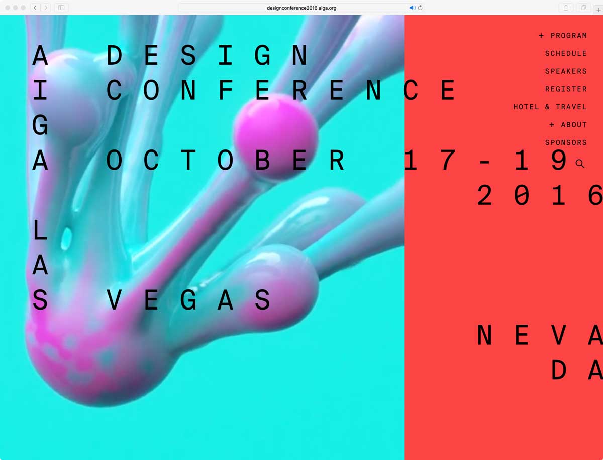
- Just because part of our role is not just about designing and developing, but also deploying. A website’s not a website until it’s live, so for us, it’s oftentimes working with the client to set up the server and deploy the files to the server and the reason for us being involved in that process, or maybe really recommending that process is because things change after the site has launched. For example, the site that you’re seeing now for the Design Conference is definitely not what was launched when we first put it out there a couple of months ago; it’s completely transformed in many ways in terms of the home page, in terms of some of the small interactions and by having that access to the server and to be in charge of deploying those changes, we can go in at any given time and make these small tweaks that no one will really notice except for ourselves, but just improve the general experience. The whole point of a website or anything digital is that it’s again, to my earlier point, it’s constantly evolving and iterating and that’s even on the project itself they were working on; it’s not just about a yearly iteration, it’s about almost a daily iteration if necessary. The reason for having such quick access is that you want to be able to make those changes that you feel are necessary to improve the general user experience that you may not have time to, or just to not consider at that initial launch. Or, more importantly, again with the case of this conference, the identities slowly evolve as well; as Mother New York was developing their general design language that hadn’t been established a few months ago but more recently introduced, we want to make sure that what was online was also a clear reflection of what was being done in the more physical and printed world, so it’s a constant back and forth in that regard, so by being responsible for the deployment as well, you can easily just go in and make those changes as the site evolves as well.
- Gary
- So, my follow-up question to that is then, this idea of phases and…for example, I think we’re so used to print, there isn’t a phase: you design, you print, you’re done. Where a website you can have a simple splash, product coming soon, and then you could add, hey, we’re going into beta: here’s some details. Do a sign-up. Then it evolves into, hey, we’re going to launch. And so there’s this very, I think all websites regardless are now this very iterative process. So, is that true and in this particular case, how aware were you in the beginning that it was…how aware were you of the phases or were there phases that kind of caught you off-guard like, oh, I gotta shift here real quick?
- Vijay
- Well, to your first point, yes; I think the idea of phases or these iterations if you will, it’s very common now. Not just because it’s a way of kind of breaking down the scope of the work and setting these milestones for this general public presence, but more importantly it’s about making sure that you’re adapting to changing user needs, if you need to, and figuring things out along the way. The website is kind of organic in that regard is that it is almost a living organism: you’re constantly evolving it to match the new needs as they arise. So, based on past experiences, this is something that we’ve kind of grown to adopt and understand that a website’s never done: it’s just constantly changing. So, with this project for the AIGA Conference, even during the initial conversations, we’re saying OK, what do we need at launch day? What is that MVP, that Minimum Viable Product take this thing to launch, get it going so that it meets your requirements to have this online presence. And oftentimes it’s more about…and this is actually a two-fold thing. One, it’s about making sure that they have this place-holder, if you will, that potential attendees can go to and learn basic information too, but also it’s about they haven’t even gotten all their content ready because it’s being crafted, so you can’t necessarily have everything all at once and there’s an expectation that it won’t be ready all at once because it’s still changing, it’s still being built out and so we walk into that conversation knowing that OK, what do we need at launch versus what we’ll do Day Two, Day Three and so on and so forth, and more importantly when it comes to the actual design changes, it’s more about, OK, we know this ???’s just not quite ready so we’re going to use this placeholder look and feel for now until you guys are ready and that was true of the background video that you see on the home page now: that wasn’t there at Day One because it just wasn’t ready, so we had a different home page, general experience for the last couple of months and then we just released this maybe a copule of weeks ago. So, we understand from the get-go that this is going to be changing, that this will be a phased approach and it helps set expectations to what we’re delivering on Day One as opposed to what’s being delivered on Day Two.
- Gary
- All right. Quickly, with that video that you have on the home page: was there ever a discussion about, hey, do we want to use a video or do we want to see how far we can push CSS animations and re-create that? Because you might…
- Vijay
- Yeah, oh yeah, absolutely. So, again, this is more from a branding perspective, those videos are being meticulously crafted for the Conference and they’re going to be used, not just on the website, but they’re going to be used on the Conference on location.
- Yeah, slide decks, the general intro animations for speakers and just the day, so we wanted to make sure that it was a strong connection between that experience in the physical location as well as this virtual experience and having those shared elements just kind of create that bridge. We talk about the web as like almost this endless portal, but it really much is a reflection of what’s happening in the physical environment and there should be that strong connection; you don’t just want two experiences; you want to have the shared experience, so we share those elements where we can to just establish that connection.
- Gary
- All right, so, I could keep going all day but I want to be respectful of your time. So, before I let you go, is there anything that you want to promote, that W&CO wants or for yourself personally, anything you want to share or anything you’re like, I wish we would’ve covered this topic?
- Vijay
- I guess from a design perspective, again, to be frank, I also came from a print background: in school I studied traditional typography, color theory and transition to digital was only in the last couple of years and so one thing I learned, it took me a while to realize is that, don’t expect your first pass or your first design to be perfect, and you shouldn’t be so fussy with something because it will change; it will change within months or within weeks because you’ll want to have a change because you’ll be able to re-examine it with fresher eyes or you’ll want to improve upon it because something has changed in just the general environment and you want to apply it to the site, so just to be less precious about things because it’s just so fluid in terms of how things are changing, in terms of just general design vernacular when it comes to online experiences, but also from technology perspectives, because that’s always changing, and as soon s you start becoming very rigid about how things are done, I think you start stymieing your potential for creativity as well as experimentation.
- Gary
- That’s actually great advice because that’s something I need to take into my own…I need to take that to heart myself!
- Vijay
- It’s a tough thing to adopt because I think you kinda lose sight on just trying to make something perfect and honestly I think you’ve got to look at it, when you deal with print, you make it and then it’s there basically for ever! If you make a book, it’s going to be on the shelf for ever and you can’t have another chance at it of re-designing the whole thing: it’s in the market-place. The web is not quite like that and so it’s just nice to recognize that opportunity.
- Gary
- But the only downside to that, and I’m referencing just myself with this one, is, and I’m redesigning the website for this: the first one I just threw together because I needed to get it out, but when I’m trying to do the next one I feel like yes, I’m over-crafting it now and I just need to throw it up there, but at the same time, if you just throw it up there, you have that kind of mentality, maybe you’re not taking a little extra step in craft that maybe you would have.
- Vijay
- Oh yeah, I mean there’s always the balance. I think you never want to lose the craft, because…
- Yeah, well I think settling sometimes does happen when either time or just the complexity of something is taking too long and then you realize that is just not worth it right now but that being said, what you’re presenting is still going to be used by an audience and you want to make sure that what you’re putting forth represents not just yourself but maybe the project goal as well and it needs to have that clear relationship, otherwise you’re basically failing on both ends. But that being said, it’s also about recognizing, OK, maybe it’s not a hundred per cent just there, but I’ll get to a hundred per cent, or not a hundred per cent, like, ninety nine per cent, tomorrow and knowing that there’s always that opportunity to make those iterative tweaks to just improve upon it. So it’s just making sure that the base is there and knowing that you can expand upon it.