The Medium of Interactive Design Versus Print Design with Bob Gillespie
In this episode Bob Gillespie Principal at The Creative Foundation joins Gary Rozanc to discuss the role of design educators in the 9 to 5 workaday design community and if they have enough practical experience to prepare students entering the industry. Bob also discusses what he has identified as the the transcending fundamentals of good design. Finally, the conversation covers the medium of interactive design versus print design and what fundamentals of good design are specific to each medium.
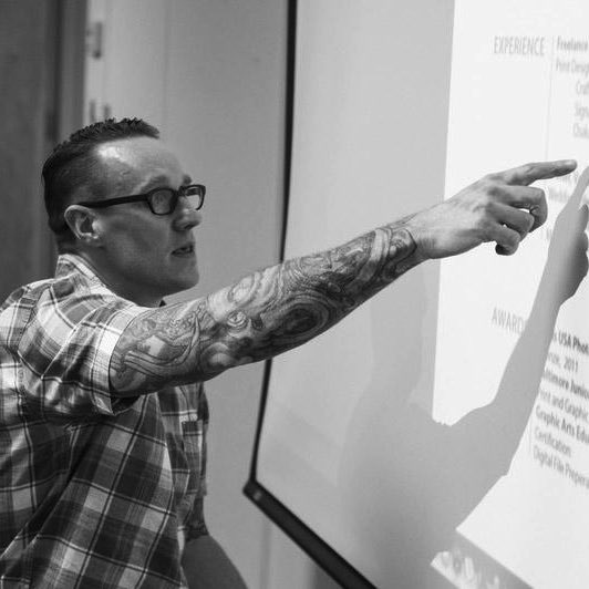
Bob Gillespie is a creative consultant and designer with over 15 years experience in graphic and interactive design. Bob’s newest venture is The Creative Foundation, where his art direction, UI/UX, eCommerce, and iOS application skills meld with his corporate branding, and creative strategy and design for political campaigns. Bob is a former board member of AIGA Baltimore where he lead the chapter’s social media and marketing campaigns and is still an active member.
Bob has earned undergraduate degrees in Multimedia and Digital Art from La Salle University, Animation from the Art Institute of Philadelphia and an MA in Publication Design from the University of Baltimore. Bob is also a sub 3:20 marathoner and a self-proclaimed beer connoisseur.
Episode Links
Abridged Transcript
- Gary Rozanc
- So, I want to give the listeners a little back-story on a Twitter discussion you and I were having last week. So, at a recent AIGA Baltimore open board meeting that was being live Tweeted, as Education Director for AIGA Baltimore, I was discussing my plan for engaging students and Faculty. You Tweeted the hard question: “Students and Faculty are easy to engage. How do you engage senior designers?” So this is where I followed up with, via Twitter: “It’s the opposite for me as a design educator, I have an easier time engaging senior designers than engaging Faculty.” and the discussion went off from there into “Are educators really a part of the design community?” Which led me to ask myself, as a design educator, am I really engaged in the nine-to-five or professional design community? Or am I isolated in the design education community? So, from your experiences at big and small firms to now running your own consultancy, what do you think? Are Design Faculty engaged in the design community the same as I guess you would say nine-to-five designers?
- Bob Gillespie
- I don’t think the answer is yes or no there. I think it’s more like a flaw in our current education system where the requirement is to be a sort of tenured lecturer, to have advanced degrees and for someone to sort of invest that time and effort and money to obtain those advanced degrees, often they roll right into teaching without really ever pushing a pixel professionally, so to speak, so in my…I went to school for a long time and education is really crucial to the success of me and all designers, but I find that all too often, you’re lacking in the classroom that real practical knowledge of what the design industry is all about; sometimes you find yourself being taught sort of pseudo industry knowledge where someone’s basing their opinion on concepts and theory but really not any sort of practical facts, data, behind it so I found that as one of my biggest frustrations, especially in Grad School where some of my Professors, they’d never worked in the industry yet they’re trying to teach me how to be successful in the industry. So, you know, there’s some…design is one of those things where you need to have a pragmatic approach to it; you need to learn by doing it but if you’re learning almost exclusively from educators who only have a theoretical understanding of the business, that’s a big chunk that’s missing from the education process so I think an easy solution and sort of you’re not seeing it as much, is more adjuncts, you kind of have to balance out your stack; you have your full time professors but also having more adjuncts who are actually in the grind, in the trenches still, designing, being successful in the industry, knowing the business side of it, knowing where the trends are so they can share that knowledge, but they’re doing that first; teaching second and I think that would really benefit the whole community and prepare students to get out there and really work and there’s a ton of design programs out there and whatever University or College I believe adapts that sort of heavy on the adjunct to balance out their tenure professors. I think those students will be more successful in the long run.
- Gary
- So, how problematic is it for the students to come from a University or whatever, a design program, we’ll say that, they come from a design program where they haven’t had the practical experience, the practical education. Is that something they can learn on the fly quick? I mean how…
- Bob
- I think that’s up to the individual really, I mean, but how are you going to get the opportunity to learn on the go if you’re coming out of School less prepared; the competitive nature of this business is immense and one of the traits you need to have is working harder than everyone else but that only goes so far in terms of having the right fundamentals to be hired in this business to where you’re going to get the right experience to actually have a long career. You can kind of fake it ’til you make it to a point but you know, to really hit the ground running straight out of School, I really think that yeah, you can have a ninety-five percent theoretical understanding of the business and design and be successful; absolutely, it happens all the time, but if you have a sixty-forty practical and theoretical understanding of design, design business, you will be so much more successful and so much more ready to do good work right away versus put time in and struggle and do bad work for a long time.
- Gary
- Can you give me a couple of examples of the things, like what experiences from your perspective haven’t the students got in that they should be getting in the classroom?
- Bob
- Yeah, go ahead, go ahead; finish.
- Gary
- Well I think it’s a delicate balancing act when you’ve got, any design program has got a limited number of classes and so I think as an educator I’m always struggling as to what is that balance and I’m just wondering, just off the top of your head, what are a couple of things that you consistently see that is under-taught or not taught at all when you see students coming out?
- Bob
- I think…so, let me go a roundabout way to answering that. When I hire designers, we sort of have this send in your résumé and have some samples on a website, that sort of thing, you’re vetting out candidates. What I do is I immediately, when I get their résumés the first thing I look at, I don’t read it; I critique it in a nano-second, just by my fifteen years of experience trained eye. I look to see if they have the design fundamentals and I can expand upon that, what I believe are the design fundamentals; if they have the design fundamentals then I think they are ready to come and help me make my job easier, I can guide them and I will guide them and mentor them and help them with their professional development under my direction but if they don’t have the fundamentals, I don’t even consider them; that résumé gets tossed, but if they have the fundamentals, I’ve hired, the last two designers I hired, I hired them at the interview because they had the fundamentals of good design ready. Obviously, they weren’t…one was junior level, one was more of a senior level; they had the fundamentals so I know that I don’t have to teach them the fundamentals of design and that’s what comes up often when I’m invited into a classroom to meet with someone’s students or I review portfolios; AIGA Baltimore’s Ink & Pixels or at a University where they do their own portfolios; that’s what I see the most and that’s where I give the most advice is tightening up the fundamentals and really I think that because the industry is what it is today where you’re expected to be this unicorn where you know print design, you know layout, you know some illustrations to do logos; you know web, not only a medium but you know how to code; all that stuff you’re getting, you’re diluting actually what they’re learning so you’re making them sort of a Jack of all trades, master of none. But it comes back if you have strong fundamentals and you understand the medium that you’re working in, then you could be successful anywhere as long as you have the drive and passion for the work.
- Gary
- All right, that actually leads me into another question that I had and that is, you wrote an article titled “The Web: It Ain’t Print.”
- And you gave a typical client scenario where you told the client, “it won’t look the same on every browser and every device and shouldn’t; this is the web, that can only happen in print,” and those were your exact words, well I paraphrased a little bit, and the client would respond with, “but I want it to look the same.” And so you hypothesized that this is the sort of thinking that comes from an expectation that the web is the new print media and it isn’t according to you. You said it’s another media altogether. So, my question is, does print design philosophy and training easily translate into interactive or digital design or however you want to label it.
- Bob
- Oh man, that question just gave me chills; I love it! The answer is: absolutely yes. The fundamentals of good design are the fundamentals of good design; they can translate to interior spatial design, they translate to architecture, they translate to composition and fine art; they translate from print to web to whatever: it’s the same. The fundamentals of good design, I believe, are the same no matter what and that’s what the students are lacking often. Some of them have a knack for it; some of them have a passion for certain elements of it and they get good at it because they work at it but I don’t believe that we’re educating students in the importance of having these strong fundamentals to roll out of their education and roll into the business and be contributing to the overall pursuit of good design. And this is…so, what are the design fundamentals, right? That’s the follow-up question; I ask myself that question a lot, I am ready to go with that.
- Bob
- So, I think that I’ll start with I think in terms of broad so: print, web, spatial design, architecture, etc; I’ll start with all those. So, number one, the use of space: understanding where things should be on the page, harmony, negative space, white space. You think about a poster or a website or an art gallery with the art on the wall. You have to have this space where it has to gestalt, everything works together but also each piece can be enjoyed individually, so that can be translated from art on the wall, to content on your website, to call to action, to messaging on a poster or an ad; it’s all the same. Color: color cannot be a crutch. I just did…Alan Peckolick from her Blue Balance partner back in the day, I just read one of his books and he says it right: color can’t mask bad concepts, I’m paraphrasing here, so I always say that color, especially in web and interactive, color needs to complement; it needs to complement the content, it needs to complement the user experience; it should not be dominating anything and it’s kind of like writing; it’s easier to say it in five hundred words than it is to say it in a hundred and forty characters. Same thing with color: do it with less and simplify that, use it sparingly.
- Another, I mean these are all inter-related, but they’re all individual pieces. Hierarchy. Hierarchy in text, image, content. Students don’t even know what a grid is; I swear I never met a student that came out of School having an understanding of grid theory, grid application. Josef Müller-Brockmann is spinning in his grave at the lost art of the grid. Paul Rand; these guys didn’t rely on the grid but they started with the grid and you’re seeing, alluding to what you asked earlier about how can these things translate into different media? You’re seeing the fundamentals of good Swiss design being implemented into the web now because of all these different devices and display sizes so you’re starting with a grid and it’s not anything new; we’ve been doing that in page layout since the early nineteen hundreds, using these grids and hierarchy and good typography is finally getting applied to the web so you’re seeing websites that actually look good: we’re not relying upon the developers who are just building it, we’re relying on designers who understand the medium to design it so it can be built right, and that comes back to hierarchy and the grid.
- Concept, right? Without a strong concept, you’re just decorating a page so I think it was…it might have been Saul Bass, I’m not sure, said that, "The computer is to design as the microwave is to being a chef." It’s a tool to get you there, but if you don’t have a strong concept, you’re just kind of wasting time. Another one, Zeldman, Jeffrey Zeldman, the great Jeffrey Zeldman: content drives design, so what’s your content? What’s your concept? Put those together, design with that in mind; design for your user in mind. Another one is research; you can’t get to your concept unless you’re doing research and what work is inspiring you to get help reach the goals of this design, so that’s another thing; do your research. When I was an undergrad at La Salle, we talked about the web and even the technology of setting up networks and stuff like that, I don’t know why they taught us that but they did, but it was seventy-thirty: seventy per cent planning, thirty per cent implementation/execution so do your research, do your planning, develop your concept and then just do the work.
- And the last part of concept, it must be flexible. Today when you design a logo it’s not just on a piece of paper or a letterhead; that logo needs to work across all sorts of medium and needs to be optimized; it needs to be flexible and the same thing goes for all design, being flexible. And the same thing goes for being a designer; you need to be flexible.
- One more, one more. And the last one, I saved this for last because it is outside of, this one’s particular to design and that’s typography. I spent some years at a design firm that did Higher Ed marketing and when I was there, for thirty-five years and I learned so much about typography there and again it’s like the same thing; what typefaces are you choosing? There’s typefaces reflecting what the brand is; are they talking to the audience? What are you using for the headlines? How are you choosing size and weight and color? How are you setting your rags up? All that stuff is a craftsman’s art and I think that with computers and just the focus on instant gratification, we’re losing a lot of the attention to detail and the craftsman approach to design where you take your time and you review your work, not just churning it out as fast as possible. So those are in my mind the fundamentals of good design and when I see a student with those, I can critique the work itself and make it better. When I see an applicant with those reflected in the résumé, I pursue them for a conversation to take it further, but when those things are lacking, I’m troubled because that is an uphill battle for that individual.
- Gary
- So, let me ask, take that a little bit more in depth; I was asking about does print translate into interactive or digital but let’s take that even a step further; so, as an educator, I’m teaching somebody how to use a grid to create relationship between pieces of information for a poster or for a magazine. Does that use of the grid, does that use of relationship of content, should that be taught, is that automatically just translate then for when you’re designing for the screen with all the different devices or do you think there’s almost like separate training now where you need to understand the grid for the different viewing experiences? Does that make sense?
- Bob
- Yeah, so I think primarily understanding the grid to help organize content on a page and make it easy to digest and scan and read and consume, whatever people say, that’s primary. But then, understanding your medium is sort of the next step so the fundamentals, they branch off so when you understand using a grid to help you lay out your content in a logical fashion on a poster, that’s great, it’s a good place to start. Same thing when you’re designing for something interactive; you understand that medium so that you start with a grid that helps you organize your content and as that display size changes on devices and things like that, you want to be able to have your content flow within that grid to help maintain the overall purpose, so it goes back to the article I wrote, probably three years ago now, that the purpose of the site, the purpose of your interactive product is the number one aspiration goal for the project but the way that the content is presented is not necessarily, it doesn’t have to be all same-sy; it just needs to be able to be presented in a logical fashion to where the goals of the visitor are met and so it’s OK that your cool styled buttons, they look great just like the comp in Chrome, but Firefox overrides them and we’re trying to streamline things by forcing it to look a certain way on every site. That’s OK, because as long as they understand that there’s a hierarchy to the calls to action to the buttons, that this is the primary button, this is the secondary, tertiary, etc, as long as you’re thinking logically and you have the fundamentals in mind, and you’re applying them to every decision you make throughout the entire project process, then it’s going to work, but it all goes back to this fundamentals and you just kinda keep using them; you hear people say; landing page optimization. That’s a great concept and a great sort of webinar to sell to a marketer, but if you have a properly trained designer, we already get that; we do that already, right? It’s not something that we need to learn but it’s a concept that needs to be sort of…go viral; these fundamentals of design can be taught to anybody; you don’t have to be a designer, you don’t have to be pushing pixels, it’s definitely theory but in my practice, in my experience, it’s one of the primary things that’s missing and I’ve seen people with long careers that have weak design fundamentals and the industry suffers because of that and I believe clients and people that are using their products are not better off because of it.
- Gary
- Thanks, that was actually really…it’s got me thinking about something, my practice in the classroom. I don’t want to move on but I want to kind of follow up that from a different perspective, so I’m going to reference you wrote an article about eCommerce web design: “Ten Principles for Success.” So, shamefully, I’ve never taught anything in regards to eCommerce, whether it’s from a usability to product promotion point of view, in my classes. So, is that a fundamental now, that idea of eCommerce that…not the usability. Would that be something that’s a new fundamental?
- Bob
- I certainly didn’t learn it anywhere except for actually once I started working for that agency; I learned it on the go and immersed myself and everything related to it and it’s sort of helped me gain clarity on why these fundamentals are so crucial because it all comes back to those; it comes back to the foundation, so whether you say eCommerce or anything where you’re trying to get the person on your side to do something; click something, throw out a form, leave their email, buy something: they’re there for that stuff, for that content, for that product; they’re there. You just want to make it as easy as possible for them to achieve their goals and we kind of refer to that as reducing friction; we want to reduce friction as much as possible because they found your site, they want to buy this product: make it super-easy for them. Don’t have the cancel button next to the buy button and have them in the same size and color; you don’t want to do stuff like that, and that goes back to hierarchy and use of color and concept. So it’s all interrelated.
- When you’re thinking about helping someone achieve their goals on your site, they want to read your White Paper or they want to download your ebook; they have to leave an email so you can get something to market, so you can market back to them. That stuff is good; they’re there for that, but you have to think about how can we make it as easy as possible for them and as welcoming for them? And you talk about there’s things that, I can’t remember what I wrote in that article, is this when I talk about accessibility, readability, those things?
- OK, so those are sort of the fundamentals of interaction design. You have to think about your audience so it starts with who’s this site geared to, so you want to make it accessible to all those people so you think about what kind of devices they’re on, if they’re in the midwest they’re on dial-up still; that still exists in this country, oddly enough, so you want to make the site as lean as possible. You don’t want to rely on heavy images; you want to make the typography, you want to make sure it’s large enough for even the people with the poorest eyesight to read, or you want to set up, write the code in a way that’s easy for screen-readers to read it to the person so that’s accessibility. Readability, sort of the same thing; you want to be able to scan the page and everything’s presented in a logical fashion; no surprises, right? Don’t make me fake; these are the same sort of things that people have been saying for a long time. You don’t want the user to have to think, what happens if I click this button; why are these two buttons that look different do the same thing? And then you start losing the trust of your visitor and whatever their goal was for the site, they end up leaving because there’s too much friction. Accessibility, readability, performance: it has to load fast, it has to work on all the devices and screen sizes but you don’t have to make everything mobile first; you have to just kind of accommodate. You don’t have to present all the content that’s on your full-size desktop version; I don’t want to say version but you can remove content to improve the user experience when you get to a mobile device; you don’t have to present all the same stuff in all the same way. All those things are important to make sure, and that’s sort of the next step; you have these primary fundamentals of good design and then you get into interaction design and then you sort of have this next layer of fundamentals of user experience design.
- Gary
- OK, I really like that idea of layers, when you start off with the fundamentals, then you add in the interaction, then you add in the user experience; I think that’s a real clear way for me to wrap my head around how to get the student out the door ready for the world. We’re getting close on time and I know you’ve got a lot to do today, but I want to ask you one more question before we start to wrap things up and that is, you have a lot of experience in both print and interactive design. So, having experienced both, when it comes to a working process, what’s the same? What’s different? Can you walk me through your approach to a project?
- Bob
- Yeah, so I kinda want to take one step back. I made my business, The Creative Foundation, because I found myself constantly referring to using the analogy of building something; whether you’re building a brand, a business, a new venture, whatever. If you build on the right foundation, a strong, solid foundation, you can put anything you want on top of it. Tear it down a few times and re-build it; as long as that foundation is rock solid, and that’s where the sort of layers come in; you’ve got to build it on the foundation of the fundamentals of good design, so whatever you put on top of it, it may or may not work; that’s the exciting part. You try things, they fail: that’s OK. But as long as you have that right foundation, you can re-build. But if you have a weak foundation, you may build a business or a venture on top of that weak foundation, but eventually it’s going to crumble; eventually it’s going to be exposed and something’s going to give, and then you have to go all the way back to the beginning and try to re-build that foundation and it might be too late. So that’s why I came up with The Creative Foundation and I thought that was a good time to allude to that.
- So, in terms of process, process is always the same, whether the project is big or small, and big or small meaning simple or complex, or the varying degrees of complexity, so if I’m doing a website that the client has a two thousand dollar budget for a Wordpress site, or we’re building something on Magento Enterprise and the client’s spending four hundred thousand dollars on it, there’s no difference in process; it just scales based on the complexity of their business, so I can stick with my process whether I’m designing a logo or a website or a publication or the whole brand; it’s always the same, it starts with research. I have a love affair with the printed word. It’s obvious why, but whenever I have a new prospect, a new client, a new project, I buy books. I buy books that are reference books, I buy books on the topic, I buy books of text filled with logos, on typography, on beer labels, on hand-drawn type; everything you can imagine, whatever will help me to inform me more about something related to the project, so I do research; I look at the competition, when we get off after our interview here, I’m going to start a competitor analysis of a new project I’m doing for a client, I’m doing their website so they gave me a list of their competitors and I’m going to go look at their sites and I’m going to see what they’re doing well and doing poorly in terms of both just design, user experience, technology and brand and I’m going to comment on each of those and I’m going to help the client differentiate from them, so it’s understanding who and why and how. And the only way to do that is through tons of research: research, research, research. And then the next thing I do is, once I do my research and I’m informed, I also interview the clients, I send them questionnaires and things to help me understand their business and who they are because there’s no amount of research I can do can help me truly understand who they are as well as they do, so getting that information from them is crucial.
- Next thing I do is what I call inspiration. After the research, I kind of have an idea of what’s right for them. I haven’t done anything on the computer in terms of design; I haven’t even gone to my sketchbook, my notebook or anything. I may have jotted down some words and things here and there but I get inspiration, so I find things that I feel like whether it’s a mood board I create or something in Pinterest, I get examples of from this website, from that website, I like what they’re doing here, I like what they’re doing in that section; here’s a page you’re going to have, I really won’t be inspired by how they used the space here; the whole gestalt of this site; I really like that. So, that type of stuff helps me help the client start to visualize where I’m going. And all that sort of evolved from preventing surprises and surprises when you’re dealing with clients often lead to re-work and this sort of small step process is highly inspired by Agile project process, project management; you keep the steps as small as possible to make sure that we’re all on the same pages, versus taking huge chunks and then having to go back a major step; we want to avoid that as much as possible, we want to keep moving forward and if we have to go back, it’s only a small step.
- So once we get through research, planning, inspiration, then it’s starting to get to work so if it’s a logo project, I start conceptualizing, working on concepts. If it’s a web project I start looking at their content and then moving around, I do prototyping, wire-framing to figure out the best way to organize their content on a page. And that’s the same thing for publication design; it’s not much difference between web and a publication; you’re leveraging the content and then presenting the content in a smart fashion.
- Then they kind of go in their own ways, but that first part of the process is always the same. Research, research, research, research, research, research. Inspiration, concept development and then execution. So again it’s like seventy per cent of your time you should be spending learning, educating yourself, educating the client, getting everybody excited on the same page and then you start pushing pixels and drawing in your notebook and things like that, developing concepts, but the first part of the process never changes.
- Gary
- Right, great, that was thorough. Thanks. Again, the idea of practicing designer versus a design educator, we don’t necessarily see the process from the same perspective so that’s good information. So, Bob, before I let you go, is there anything you are working on that you would like to share or promote, or maybe a final piece of advice you’d like to give design educators?
- Bob
- I’ll answer both. Creative Foundation, graphic design, branding, interactive design; it’s a fabulous young business and I love what I do and my clients and I have great relationships; everything I’ve talked about has been the result of having great clients over the years and I continue to aspire for that.
- Check me out and if you’re a student, hit me up; I’d love to see your work and help you get it better and help you plug any holes you have in your understanding of good design fundamentals. If I was going to look at one last piece of advice, I always felt, and I still feel that way, mentoring young designers, mentoring my staff and colleagues is important. I believe that the industry would be better of with better designers out there and I hope that one day people will look at my work and say: man, he was kind of terrible but because we’ve gotten so much better than we are now. I look at that as a great aspiration that we have great design forever and I think it would truly transform society.
- So, my advice is, whenever you’re meeting with professors, clients, colleagues, potential employers; go and do your research first. I think you need to aspire to be the smartest person in the room and that doesn’t need to be a reality; that can be a perception and I’ve had great success in my career, aspiring to be perceived as the smartest person in the room. Now, what does that mean? That means you do your homework; it goes back to research. You immerse yourself in their business, you immerse yourself in your business, you know what you’re talking about. If you’re going to be designing websites, you understand the medium that you’re designing in. If you like typography, you need to show it and practice it all the time, you need to just keep getting better and better and better. If you like illustration, who are your favorite illustrators and why? And whose work do you want to emulate? Who do you respect greatly in the industry? Those are the things that are so important and it’s understanding your business, what you love about your business and also your client or potential employer or whomever you may be doing work with, understanding their business, so you can talk about it at a high level and you’re having a conversation with them, you’re building a relationship with them first; it’s not necessarily you’re asking a bunch of questions or you’re asking them a bunch of questions. It’s you’re having a dialog to get deeper into it and if you aspire to do that and if you really work hard to do those things to work on being the smartest person in the room, you’ll be having a great time in this business.