The Entry Level Designer’s Struggle to Keep Up the Necessary Work Pace with Kelly Driver
In this episode Kelly Driver, Senior Interactive Designer at idfive, joins Gary Rozanc to discuss the interactive design process including how designers and developers work together, how much HTML and CSS designers really need to know, and how entry level designers have trouble keeping up with the pace necessary to be successful in the industry.

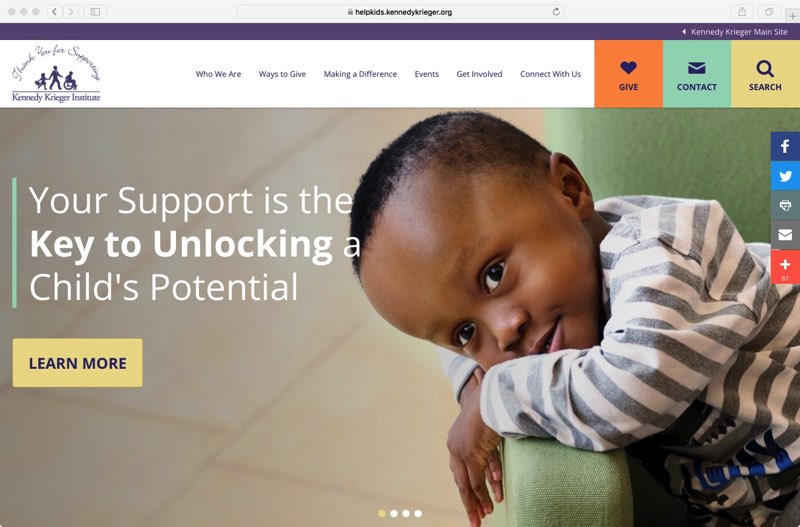
Kelly Driver is a Senior Interactive Designer and user experience researcher at the Baltimore area firm idfive. Kelly works to understand an audience before she designs for them. By applying testing and research to her design methods, Kelly bridges the gap between design and UX—an increasingly vital task in our industry—to ensure her projects work just as good as they look. Kelly’s created beautiful and functionally effortless work for a variety of national and local clients including Special Olympics, Johns Hopkins University, The Kennedy Krieger Institute, and Baltimore Office of Promotion and Arts.
Kelly’s focus and interest lie in human-centric design. Putting her users at the heart of her research and design process, her work is empathetic to the audience’s goals and concerns. Kelly feels that design has evolved to be more than just what something looks like and how it functions. Design is also how it makes you feel.
Kelly holds a B.A. in Studio Art, with a concentration in Graphic Design and a minor in Art History, from the University of Maryland, College Park, and an M.F.A. in Integrated Design from the University of Baltimore. A firm believer in the importance of community involvement and the value of inspiring others, Kelly’s also an undergraduate adjunct professor.
Episode Links
Abridged Transcript
- Gary
- Great, so, one thing that I wanted to mention, and this is for the listeners, not for you Kelly, is the reason I asked Kelly here is she’s part of idfive and they participated in our Design Week and they gave a studio tour and as part of that studio tour I was listening to her literally describe every part of the process on how they do work and since I redesigned a course this semester that was literally about workflow or how do you work in teams, how do you work at a firm, I wanted to have Kelly on to kinda talk about that experience, so my first question, Kelly, instead of teaching the Adobe Creative Suite because tutorials can be found everywhere from lynda.com to Skillshare, I want to teach things that are much harder to find online, like workflow, which I define as everything from naming files and using version control, to project management and communication tools, so my first question is about design workflow. How prepared, or underprepared, are entry-level designers when it comes to the basics like properly preparing files, using naming conventions, version control and things like that?
- Kelly
- Yeah, so I definitely think that is something that when you run into entry-level designers, it depends not only on their skill-set of how organized they are just overall in their personal life and how they structure their Photoshop files but also just overall if they’re an organized person. Usually it comes into play when somebody’s really disorganized, you can find that they have issues with you know, not being able to properly prepare their files or they could have trouble with naming conventions but everywhere that I’ve worked, actually that whole process has been different and I’ve had to learn that as soon as I’ve actually come to play and you know, become a part of the team and learned what that process is, so there definitely is a learning curve for entry-level designers, especially when they’re new to a team, it seems like every team has a different convention that they use and it’s something that you just have to learn and kinda live with because you’re working with team-mates and you’re not the only one working on those files so they need to be organized enough if you’re going to pass them around.
- Gary
- So, at idfive, how do your designers handle the file management? So, basically production artists can hand things off to developers and how they hand things off to each other. How designers…how do they work together? What does an actual…you said two designers will work on the same file. What does that look like? What are you doing and so do these files live on an internal server or do you use a file-sharing service like DropBox?
- Kelly
- Yes, so we actually use GoogleDrive. I really like it because I can have access to all of our files anywhere, which makes it really easy for if you have any need to work remotely. I also like GoogleDrive because it allows you to sync specific projects or files to your computer so that you can easily update without having to re-download multiple things so it gives you really easy access but then it also is easy to share files with team-mates; GoogleDrive has that sharing ability where you can just share a link with them and they can easily go to that link, download your file and they can jump right in. So, that’s what we use here and it seems like one of those things that’s really…I guess to me like a no-brainer. We’ve never had any issues with it; all of our designers use the synching functionality and I’ve never had a problem passing files off that way. And the great thing about it is GoogleDrive has version control and so if you accidentally delete something, you can recover it. It definitely saves you a little bit too so it’s definitely something that I think we all like here.
- Gary
- So, what do you…when you’re working with another designer, what are the things that you sharing? What are you working on that you hand off to somebody else and what are they doing? Because in School, a student gets a job, gets a design brief and then they just design the entire thing themselves.
- Kelly
- Right. So, we’ll share our Sketch files, especially with the design team, especially if we’re working on a website, those are the type of files that we’ll be sharing and within that Sketch file will be the assets, typically the way that we organize our projects, we’ll have an assets folder including all the imagery, any iconography that we’ve built out, if there’s a style tile that we may have built, we’ll share that amongst the team as well as the raw Sketch file that a new designer or new developer could easily jump into and work from, even if they’re not necessarily going in to edit the file, it’s good for us to share it with them as reference; our developers really like having that file so that they can go in and check sizes and hex colors. The passing between has never really been an issue, just as long as we provide all those assets right up front and of course sometimes you forget, so just working as a team, make sure you get everything together.
- Gary
- OK, that’s what I was wondering, what was the actually specifics so it’s like hey, I need this font and I need the Sketch file as a reference point, then when it goes off to the developers, that’s a different story altogether but yeah, of course they love to see that. So, when I assign a project, I give students a design brief with project details and deadlines all neatly typed up into a blog-post so I’m pretty sure clients don’t do that for you, ever, so how does this process work at idfive? Is there a Project Manager or an Art Director using something like Basecamp to keep everyone on task? I mean, what happens at that initial client meeting, all that good stuff?
- Kelly
- Yeah, so when we kick off projects, us Designers work alongside Project Managers as well as any other key players on the project, so sometimes our kick-off meetings we’ll have Strategy Members, we’ll have Developers and then we’re always given a creative brief to help outline the needs for the project but when it comes to deadlines and scheduling, that’s our Project Managers, they work with our clients to set those milestones so that when we do have that kick-off meeting, we’re given an idea of what the general schedule is and where benchmarks are so that we know what our budgeted time is for working on whatever part of the project we’re working on. When it comes to our Project Managers actually communicating with the clients, some of our Project Managers use Basecamp and that’s so that they can easily upload files and share things that we’ve been doing; great resource for communication between the client and our Project Managers. The creative team is not so much involved with using Basecamp, that’s more for just client-facing communication and then we have other actual Project Managers who just through email are able to communicate and pass files back and forth and set those schedules and those milestones.
- Gary
- Wow, that’s got to be kind of confusing for you to have two different project management styles within the same company?
- Kelly
- No, well it’s a preference I think to the Project Managers because we’re not really client-facing and when we are client-facing, we’re presenting our work and we’re going and meeting with the clients face to face and you know, expressing why we made our designs how they are and we’re going through creative briefs. It’s the communication factor of how files are passed is more I think just an organizational preference of if the client feels comfortable using Basecamp or if they’re more comfortable with email. I don’t think it really has any confusion on the creative team side at all, just because we’re not really involved in that hand-in-hand back and forth.
- Gary
- No, that makes sense, because training the client’s hard enough and training them in something like Basecamp just so they can communicate with you…
- Kelly
- Right. Some clients, they’ve used it before so that’s their preference and then other clients are just not very tech savvy so email is actually the best route.
- Gary
- OK, so how to do teams, whatever their make-up in idfive, how do they communicate? Examples like, should I be having my students use something like Slack to simulate how they’d be working as a team and also should I have…well, how do they communicate? Let’s just start there!
- Kelly
- Yeah, so we actually do use Slack internally; it’s pretty awesome because you can ask someone a question without interrupting them while they’re working or interacting others around them. I also really like it because you can set project channels and include everyone a part of that specific project so you can kind of follow along with what’s happening on that project, even if you’re not necessarily working on that project that day. It’s very helpful for when us Designers pass our files over to Developers, we can keep track and see what they’re working on and where their questions are, everybody can just go right to that channel and talk and collaborate rather than us all having to set up a meeting that they we’re all crammed into a conference room, sometimes it’s easier to just ask the question on Slack and get a response from five or six people and then move on, so I really like it.
- Gary
- And the funny thing about this is right now, idfive is hosting us as well so we’re recording this in the conference room and literally they could walk across the room to ask that question but…so do a lot of you work remotely too? Is there like…
- Kelly
- We have a few people who work remotely and then we also, you know, just on any given day some people just decide to stay home because you know, life happens and there’s kids or they’re not feeling well so definitely we have the flexibility to work with remote users.
- Gary
- OK, so, another question I wanted to follow up with that when I was asking about the brief, like I said, I hand the student the brief but in reality, you’re not handed the brief by the client: you’re basically…I mean, I would assume they come to you and say, we want a website. Do they start…so, who determines the scope and what they really need?
- Kelly
- Right, yeah, so we have a strategy in a New Business Team that really works in defining what their needs are and what their goals are and from there, that creative brief is built from all the research that idfive does and that’s just a part of our process so we’ll do tons of research to really build kind of a framework of what we believe is best for our clients and then that internally we’ll make a creative brief which we will then share with the client and get their approval and that this is the right tone, the right messaging, this is the right direction and that gets shared with us designers that we can use as a guideline to help us with our creative process.
- Gary
- So, let me ask you then, this semester for the first time, I had my students in my Web Design class where their task was to create mock-ups in XD or Sketch, something like that, for a web conference and I actually had them interview somebody who puts on a web conference, to do the re-design and they had to ask them, ask this person questions, get the feel of it, you know, kinda like set-up. They’re asking questions so they inform their style tiles but I said also, you need to now write a proposal on what you’re going to create for this person. Is it a single page, is it multiple pages, what are the things that they are going to need based off on this initial interview. Is that something like…is that similar or at least a decent facsimile?
- Kelly
- Yeah, I think for us that’s a part of just like the project’s proposal, what actually is detailed and what we’ll be doing for them specifically. When it comes to creative brief, we’re talking more about the messaging, the tone, who the audience is and what we’re actually trying to achieve creatively to reach their goals and I think that creative brief can be…can include those things like the style tile and elements but I think that’s something that you can build onto after the fact of after you’ve done your design, you can go back to the creative brief and make sure that what you’ve done has really aligned with what you set out to do on the project.
- Gary
- You know, one thing that just popped into my mind. I struggle with the content, meaning…so I have my students design, style tiles, but it’s like, when do they get the content, when do the visual designers get a glimpse of the content to inform their design decisions? They kind of happen simultaneously but I’m confused about that part of the process.
- Kelly
- Yeah, and I think that’s dependent upon the client and what they have available; I’ve run into being on some projects where we don’t see the content until we’re doing content migration so you have to kind of design with the very open mind that they may need a table, they may need accordions; you have to think of every situation that could possibly be needed for a site and how their content could be broken up. We call those "kitchen sink" pages where it’s just throw every single element, design it, if there’s a niche case for using it, we’ve thought about it. We also, I think clients that have the content, you want to build around that but you also don’t want to limit yourself so much that in the future if they go back and make changes to it, your whole design is not broken because of that so I know personally I design very modular, that I try to create consistency across the different elements that I make, to make sure that if I’m using it on the home page and it’s treated like this for a testimonial, somewhere else on an internal page it’s probably going to look very similar if they choose to use a testimonial on an internal page, so I think for me it’s more of like having a check-list of items that, these are the things that they’re probably going to need to use, a table, testimonials, call-outs, forms, buttons and making sure I cover all those things stylistically and then frame-working it when we do the designs.
- Gary
- All right, you answered my next question, the follow-up question was that idea of design systems, so you’re building this system but you have a check-list of some of the more common elements that start here?
- Kelly
- Yeah, so I definitely have a checklist and I’m definitely an advocate for design systems in creating consistency. I think it not only helps the designers but it also helps the developers and then for your users as well when they’re visiting your website, when they start seeing consistent things they’re not getting lost in your site. The expectation is there for what they’re looking for and it’s easier for them to find things, which I’m a big advocate for.
- Gary
- One more side-question before I get back onto the main questioning, but with that idea of systeming, that students when they’re just beginning to start, they end up repeating things over and over and over again, which becomes problematic. So, we do our best to try to break that but would you rather have somebody who’s strictly following…a beginner, would you rather have somebody who really follows a system so at least you can see that they understand the system and then you break them of, OK, now this is when we veer from the system, or would you rather have somebody who’s going out there and trying to reel them back into making a system?
- Kelly
- I think my preference would be somebody who goes out there and really pushes the creative and then when we look at what they’ve come up with, we try to find ways to make the consistency happen. I think there’s a lot of opportunities when you push your design, if it is chosen you can then take a step back and say, OK, well, I made this element for this specific area of the site: I can also do something similar for something else. There’s definitely ways that you can re-use elements and start making that consistent trail of that pattern library but I think your first shot, you should definitely be pushing it and you should not be restricting yourself to those things.
- Gary
- OK, so, before I move onto the next line of questioning, how do you handle both client and internal feedback for the visual side of the design process? Things like: record it, how do you track it?
- Kelly
- Yeah, so, usually internally we’ll have just group meetings and we’ll talk and discuss amongst ourselves. I simply just take notes. I really like actually sending out pdfs and having my team members comment on the pdfs, specifically in different areas. We have also started using InVision in creating interactive prototypes that we then share amongst our teams and InVision’s great because you can actually comment right in your prototypes so that’s something that we’re advocating for right now is using that more and more, especially for clients too because then you don’t have to explain as much because you have this great prototype they can actually envision what you’re trying to do.
- Gary
- Follow-up on that. And this is for listeners, literally this feature that I’m about to mention within InVision, it’s only been out a couple of weeks, it’s called Sync, have the developers jumped on that?
- Kelly
- Yeah, so we actually internally have had discussions about it. We haven’t used it yet for any project for client-side but we’re playing around with it internally and trying to figure out how we can actually get that a part of our flow and especially when it comes to passing our files from design to development, it seems maybe the devs don’t need the Sketch files: maybe they just need the InVision link so that they can click around and grab all the assets that they need. It seems like a great tool and we’re trying to fit it into our process.
- Gary
- And this is just for the listeners now, so in case you’re not aware, InVision makes a plug-in for the Sketch app which is called Craft. Within Craft, you can set up style sheets, they now call them libraries; you can do prototyping, you can do all kinds of other things but they just added a feature that’s called Sync which I guess more or less pulls out a lot of what the developers would need from the Sketch file which would be hex numbers, CSS, you know, that’s related to the typography and other things like that so they no longer have to look at the Sketch file, they can just log in and see the elements that they need to start working on things, so it’s good to see that…I love the fact that you are always kinda like seeing what’s new out there. It’s because there’s a lot of it!
- Kelly
- It’s constantly changing.
- Gary
- So, this is something that I’m struggling with. I’ll give you an example: students today where you’re showing their work and one of them had a three-column in a medium-sized layout which would eventually be tablet, I’m looking at them like, there’s no way that’s going to work; it would be too tight. But they don’t know that and so how do you go about creating designs and then testing them in a browser to ensure the typography’s appropriate size, that the grids work and things like that across all these different devices we’ve got now?
- Kelly
- Yeah, so when…in our process, we’ll design the largest situation which is desktop and then we’ll also design the smallest situation, which is mobile and when it comes to tablet, that is where we do tons of sketches because tablet, there’s so many different sizes for tablet that you can’t really have a defined size of this is what’s going to happen on a tablet device. The iPad mini is almost more similar to a phone than it is a tablet so you definitely have to be flexible when it comes to the tablet sizes but there’s a few plug-ins that I use. I uses WhatFont browser extension which you click on it and you can hover over any font on your browser and it will actually show you what the size is, what the leading is, what the actual name of the font is, so from there, just using that simple plug-in, I’m able to QC and kind of quality control and make sure that the font’s not too small, it’s using the right font and there’s a lot of collaboration back and forth with our developers. I mean, I may design it at sixteen pixels and then when it goes live I’m thinking, oh wow, this is way too small because every font’s different; it’s really hard to say that there’s an industry standard for the web because the fonts just display differently so there’s definitely some flexibility in our QC process of we’re working back and forth but when it comes to actually teaching that, I think it’s having the understanding of how things kind of break apart from taking your full design and how you can make those into different units and how you can re-stack those.
- I always, when I’m designing for tablet and mobile, I look at what I’ve done on desktop and I start at the top and just think OK, from an HTML and CSS purpose-wise, how is this being built? And I think that actually, you kind of need to have a little bit of knowledge of how HTML and CSS works to successfully think this through but usually things stack from left to right in code so that’s something that you can take into consideration when you’re thinking about how things break down on tablet. I think teaching it though, I would probably just start with tons and tons and tons of sketches and then from there, identify what things wouldn’t necessarily work because every website is different so I could see a case for where three columns would work fine, if you don’t have that side navigation, why wouldn’t it work? So there’s definitely I guess tons of flexibility when it comes to tablet sizes and you can also go horizontal, you can go portrait, so you have to think about that too which makes it even more difficult, but here we’ll focus on the desktop as well as the mobile and then work very closely with our developers to kinda break through what’s actually happening in that middle, those middle zones.
- Gary
- I think that’s…the sketching’s a good idea because I think it’s OK, so you have that experience, so if your group does enough sketches you can say, I just know from experience this one sketch is not going to work and nobody really wasted any time in the development phase of it so you have to accept the fact that somebody’s going to have the experience and so in my case, I’m the one, as the educator I have the experience to say, no that’s just not going to work, but I need to make them sketch more out those middle stages.
- Kelly
- Yeah, and I think with sketching, it’s kind of like you get all your ideas out there fast and you get tons of ideas out there fast. Sometimes when I’m stuck on something I like to do kind of a sketching power-hour of just taking an hour and getting every single thought out there that I can of how it could translate and I do this even for websites if I’m doing wireframes and stuff, every little situation because most of the stuff, it’s not going to work, but you’re going to find a solution pretty fast if you’re just sitting there sketching and thinking through all of the potential options. And you’ll be able to see what seems like the best route to take and I think collaborating with others and really learning about responsive design is where that middle range is really going to be successful.
- Gary
- What do you do…students have, every educator across the country has a hard time getting students to sketch out ideas; they just want to jump, immediately get onto the computer. So, I’m assuming when they come here as new students, I mean, as new employees, they have that same habit of they don’t want to sketch out. How do you get them out of it or is it just simply the fact that they’re like, oh my God, now I’m getting paid. That’s what they’re doing, I’m going to do it?
- Kelly
- I think everyone actually has a different process. I am a sketcher and I actually like to search around and look for inspiration. I go to Behance, I’ll look at other websites like SiteInspire just to try to get motivation and inspired by others’ work to say that I don’t want to do something boring and generic and something that we see all the time, I want to do something cool that’s going to be different. So for me, taking that initial hour of doing tons of sketches and exploration, it really helps me divide into my creating process but I also know other designers here who don’t need that time and they actually work a lot more efficiently by diving in and making the mistakes as they go and sketching along the way, so they’ll start designing right away and then they’ll get to a point where they stop and they’ll be like, oh, I don’t know how to design this section and then they’ll sketch a few things and make a decision and jump back into their design, so I really feel like it’s actually a learning process if you need to figure out what your creative process is and how you can jump-start a project and everybody’s…I truly think everybody’s different; there’s not really a right route that you could go but I think exploring different ways of getting yourself motivated and getting yourself starting a project is the best way to figure it out.
- Gary
- OK. For me, I actually like to code it! So, I have to get in there and actually make it to see if I really like it, just like the sketch, what it looks like on paper or what it looks like actually in Sketch app; I use Sketch too, I don’t truly fall in love with it or dismiss it until I get it into HTML and CSS which is time-consuming!
- Gary
- Yes, it is. So, and you’ve already kind of alluded to this; I think visual designers need to learn some HTML and CSS because they need to understand the medium they are working on which is a heck of a lot more complicated than understanding ink and paper and different types of the printing process. So, from your experience, stopping short of producing the mythical unicorn, just how much HTML and CSS would you like your visual designers to know?
- Kelly
- I think having an understanding of how to use a browser’s inspector, so that you can go back and communicate with your developers is really important. We’ll say line-height, they’ll say something else. Leading, you know, there’s all these different tools that they’re doing the same things but when it comes to HTML and CSS, the naming might be slightly off, so I think having an understanding of that vocabulary so that you can communicate with your internal team but also the more that you know HTML and CSS and how that actually functions, you don’t need to get into hardcore JavaScript or any of the back-end, but just the general understanding of how things, especially from a responsive standpoint, how you can start with something that is twelve columns and go down to three columns and what’s happening in the code specifically. I think that’s going to make you a stronger designer; you’re not necessarily going to be this amazing unicorn but you’re going to have the knowledge to then communicate to your internal team as well as your clients because from a designer standpoint, if we’re pitching these projects and these visual designs and we’re actually presenting them to clients, they’re going to ask you those questions; well, what does it look like on mobile? And you need to be thinking about that and if you have a little bit of knowledge on HTML and CSS, you’re probably already thinking about that while you’re designing so you’ll have those answers before they even ask you so you’re way more prepared.
- Gary
- And onto that idea of understanding the languages; for the life of me, I don’t understand why, neither in Sketch or in Adobe XD why there isn’t padding. Why don’t you apply padding on a box? All of the design things, none of them mimic how HTML and CSS work so if you used, instead of using leading it used the term line height, there is no more communication gap, so that’s just a source of frustration. I’m waiting for a third party to come out and make one that just uses the vocabulary of CSS for their little drop-down menus and things like that. So was there anything I wanted to follow up? No, I lost my train of thought, so we’ll just move on. So, another area where I’m having trouble with is with micro-interactions and by that I mean animating drop-down menus, animating buttons, page transitions, modals, alerts, etc, all of those type of things that really do help improve the user experience. If I want my students to focus on micro-interactions I’m either teaching them After Effects or I’m teaching them CSS and this leaves like absolutely no time for actually discussing: is this the appropriate interaction? Should it shake a little bit more or is it not, you know, does it not change fast enough? So, how does idfive handle the visional design of micro-interactions?
- Kelly
- Yeah, I think that’s a good question and I think sometimes the micro-interactions are what gets lost and forgotten about and it’ll be a few…it’ll be far into development and we’ll be like, oh man, we didn’t think about that hover state. But I think micro-interactions are actually what makes a website pop and come alive so it’s really important and we’ve started from the visual design side thinking about by, we’ll do a design, a flat, that strictly doesn’t represent any of that but then we’ll have a flat that shows all the hover states, so there’ll be a drop-down open, we’ll have a little mouse hand hovering over something to indicate what it looks like when you hover and using InVision has actually been really helpful because we can start mimicking some of those interactions that we want. Now, InVision doesn’t have all the tools and animations out there in the CSS world and HTML world that you can potentially use but what’s really great is it at least gives our developers a starting point of what we want it to happen and then really once they get to the point of needing to start doing interactions, that’s where we actually sit side by side our developers and work with them and we’ll sit there and make those tiny adjustments of, oh I want it to be just a smudge, you know, slower, a little bit faster and that’s something that I think is just the extra detail that you need to put into your projects. I don’t know if After Effects or CSS animations, having the knowledge of how to do that, is really good, but I think forcing yourself to think about those when you’re designing your original concept is going to make you think about speed and all that other fun stuff; it’s going to come to you a lot easier if you’ve already decided what it’s going to look like, you’re going to have a much easier time figuring out what the specific flashy thing that’s happening is going to be.
- Gary
- Those micro…with the micro-interactions that you mentioned; so, you work actually alongside the developer so you will basically kind of give the developer the begin state, the end state and you kind of give them…because you can have it slide, you can have it fade; do you give them, this is how I want it to get from Point A to Point B and then you kind of go over and say, let’s tweak, or…
- Kelly
- Yeah, so usually there are inspirations that you’ll see on other sides, you’re like, ooh, I want it to be like that, so I’ll usually have a whole list of links of interactions that I’ve seen out there in the world or even CSS and JavaScript libraries of interactions that the developers can explore how those interactions are happening and re-use those, so there definitely is a little bit of research on the designers and of finding those interactions and then thinking about visually how they look from the start to the end and then sitting alongside the developer and tweaking them along the way.
- Gary
- Oh, and one other thing that I wanted to…you mentioned earlier that I kinda like, if you could actually see the podcast, I rolled my eyes because this is something I don’t do was the developer tools using developer tools in the browser to check things So, the reason I don’t use them is, it didn’t exist when I first started learning web design so I always…View Source was how I did it so I never really bothered to learn the tools. Everybody in the industry uses them so can you give some examples for this stubborn person over here? What should I be showing my students with the developer tools to look at the code?
- Kelly
- So, from a designer standpoint, it’s really good if I’m checking a color, a font size or if they’re using a specific font. Another is just to check if we have back-up fonts so you have a unique font that you’re using on the site and you’re thinking wow, that doesn’t look right; you can see the string of OK, it should be Open Sans and then it should be Helvetica and then it should be Ariel. Oh actually it’s defaulting to Arial for some reason. So, you can go in and identify little tweaks like that, that could potentially be larger issues. I also really like it for assets if I need to jump in and grab a photo, I can quickly go in, see sizes, see why things are cropping in a certain way. For me, it’s very basic but at the same time, just those simple basic tools in that inspector area is really helpful, especially I think typography is the biggest on because I can sit there and play with the numbers myself and then go back to the developer and say, OK actually I know in my designs I set it sixteen pixels and you know, the leading was twenty two: actually, can we make that adjustment a little bit bigger, I would prefer it to be twenty pixels. So, rather than going back and forth with them, I’m able to provide them a direct response to some of those things that I would want to make adjustments to.
- Gary
- OK, it’s something I know I need to do; I just don’t use it myself because I didn’t need it but I know everybody else does. All right, so my last question regards to critiquing and testing visual designs; it has to do with performance. Do the visual designers take performance into consideration before they start designing or does it happen after the project is handed off to the developer?
- Kelly
- It’s definitely something to consider and I think you need to consider it definitely at the beginning of your design. We try not to let that stop us from pushing our work but you kind of have to have a plan of action for it, especially if your website is going to have tons of images and videos, you have to think about what all those assets are going to do from production and load time. And the way that we usually do it is we’ll push our designs but then once the project is actually in development, the designers work alongside development and making sure those assets are optimized and not causing the site to drag and be super-slow and there’s tons of resources out there, I think it’s tinyPNG where you can load your assets up to and it tries to optimize it down as much as it can without losing any quality so we definitely go through that and you know, it’s also hard because your clients can provide assets that you may not be able to edit that well but we always work around and just work as a team to making it work but I will say, it doesn’t hinder our designs but we’re definitely thinking about it.
- Gary
- OK, so was there any kind of internal talk between you and the developers, with HTTP versus HTTP2? So, the reason I ask that is if the new spec is HTTP2 and I built a…so, traditionally, lots of images means it’s a call to the server, it slows everything down but HTTP2, once that initial call is made, it doesn’t have to make another call, it just immediately that call’s open and it just keeps downloading stuff so I found websites that were performant in the old standard are no longer performant in the new standard, meaning I could use more images and instead of having just one big Sprite which is like accomplish fifty images, it was actually better to split them back up again so have you talked about that at all? Sorry for the curve there!
- Kelly
- Yeah, not necessarily the HTTP. I will say, we don’t use Sprites, so all of our assets are individually broken up and I think that we’ve found a few ways, especially sites that have interactions and there’s micro-interactions that we were talking about, there’s ways that as the page is loading things are loading in the background that you might not necessarily see so as you continue scrolling down they’re loading in but what really was happening is, as soon as you started on…saw the home page, it wasn’t loaded in so we’ve found ways to actually progressively have assets roll in without you kind of feeling like you’re missing things.
- Gary
- OK, it’s that idea of perceived performance: what you see in the browser window, whatever size device it is, as long as that loads quickly, you can…
- Kelly
- Yeah, other things can progressively load in as soon as you’re scrolling down the page.
- Gary
- OK. So, based on your experiences, what are intern and entry-level interactive designers missing that design educators should be addressing in the classroom?
- Kelly
- Yeah, so most young designers I’ve run into usually only have one or two small web projects and it usually only includes a design of a home page. I think it’s really important to include internal pages, wireframes, sketches: show us your process of how you actually came to get to your final product, especially with web design because there’s so many ways that you could do an Information Architecture; you could set up your navigation; there’s hamburger menus, there’s traditional menus: what made you make those decisions? Show that process in your actual work. I also will say that sometimes young designers seem to go through the motions with web design, so they’ll have the logo slapped right in the left corner, you know, their nav items right on the right and they’ll have a big hero image and it feels very templated, very much the same as what you see everybody else doing and sometimes you don’t have projects that are glamorous so how do you take something that’s structured like that and make it cooler than just a bunch of boxes on a page and not seem very outdated and old? I think that is something that I constantly see is, they have the skill-set but they’re not pushing it as far as I’m sure they totally could.
- Gary
- So, do you have any types of projects or experiences you would like to see design educators incorporate in the classroom? These could address the problems that you just identified or be something you’ve been thinking about personally?
- Kelly
- I think personally, so this is just from personal experience, what I wish I would have had in the classroom would be more realistic timelines of what it like in the real works. When you’re in school, you could potentially be in class and have three large projects, you know, you have your final project, your mid-term and maybe some small homework assignments every week, but in the real world you have tight deadlines and you ma be given something that you only have a few hours to work on so you kind of have to not be so particular about things; you have o really get your creative juices flowing and that’s where you have to learn your process, figuring out what works for you to get your creative juices out and can get work that is successful and I think that’s something that a lof that a lot of people when they do start working as a new entry-level designer, they’re shocked by, oh my gosh, I have this design and I have to have it done by Wednesday; that’s only two days to work on it; they’re used to having three or four when they’re in school and I think that is actually…school kind of…I don’t know, it’s a little fake in school in that regard.
- Gary
- It is. I had an old, where I used to work at Truman State, the Department Chair there had this theory that one, students wouldn’t spend more than forty eight hours on a project anyway, so he just said, I’m just going to assign a new project every two days. And you have two days to work on it and then we’re moving on and we did a kind of a test and where he did a project every two days, where I gave them, like you said, three projects over the course of the entire semester an the quality was pretty much the same between the both of the. So, what kind of things do you only get eight hours or two days to work on?
- Kelly
- Just about everything!
- Gary
- So, the initial design or…because a website, it takes a couple of months to do so you only get eight hours or two days, to work on what part of it…
- Kelly
- Our visual process is that it will start in strategy and they’ll create that creative brief that we were talking about and our UX team will work through all the navigational and the wireframes and what the IA structure will be like and when we get the wireframes, that’s our opportunity to really start thinking about the visual design and those micro-interactions and how we’re going to plan to work with development. Usually our first pass, depending upon of course every client’s different based on timeline and budget. Some clients, you know, we’re working under templates; other clients it’s a totally custom site, so custom sites you’re going to get a lot more time but usually our timelines are around ten to or eight to ten hours for your first pass at a design and that can seem very stressful for a new designer because you could be given eight hours at nine o’clock on a Monday and eight hours later is actually five o’clock that same day but you’re working on tons of other things and you have your entire creative team there to help get your ideas flowing and again, if you’re running into a wall just go back to sketching. I don’t think that we’ve had a problem with the timelines being really short. It’s immense fun because it’s like, OK, I have eight hours to knock this out and make it really, really good. It also kind of challenges us when we get ten hours, like, oh my gosh, we have two hours, what can we do to make this even more amazing. It seems tight but we make it work really well.
- Gary
- Well I mean, you have ten hours or whatever the magic number is, to get the initial concept out. How long do you get to polish those?
- Kelly
- Well, that’s including polishing; that is getting it out and ready to present to client, that is going through internal revisions of working with our Creative Directors and the Project Managers to make sure we’re meeting all the goals and then getting it ready to be initially presented to client. Now, we’ll present multiple designs, so, clients, so in the first pass we may have two or three designs and then once they choose a direction, that’s where we’ll start working on internal pages and maybe those are visions from their feedback com in and we can really start finessing it and giving it a little bit more polish and attention on things that maybe we may have missed in the beginning, but usually after those first eight to ten hours, we’re ready to go and have a solid start of presenting something that, if they were to choose it and say, no revisions, we feel really good about it.
- Gary
- So, what does that deliverable look like then, after the first eight hours? What are you giving? A home page, a component?
- Kelly
- Usually it’s just a home page; we’ll give a home page design and from there we’re really pushing to use InVision to mock up a prototype of what those micro-interactions would be on the home page so that they’re just not looking at a static pdf. I’ve been in client meetings where we’ll say, oh, the header’s actually going to pin to the top so as you scroll, you’ll always have access to the header and our clients will be looking at a pdf and they’ll say, but, it’s not pinning for me and we’ll be like, well, it’s a pdf so, having that InVision prototype has been really helpful for us in communicating those small micro-interactions that our clients get really excited about because they can start envisioning what their website is going to be and how those interactions are going to flow and then it just makes it easier for development but once they actually choose a direction that is where we’ll go back and continue on internals and mobile design as well as fleshing out any of the in between of tablet.
- Gary
- So, how many hours…can you give a rough estimate, how many hours they get on the internal stuff then?
- Kelly
- Depending on how many internal templates, I would say it’s…because there’s some projects we might only do two or three templates and then there’s other projects where we’ll do ten to twelve; it really depends on the budget and the timeline and what the needs are for the client but I would say the timeline for that is anywhere from ten to probably thirty hours.
- Yeah…so a lot more time invested on internal, that’s where the bulk of the material is on these websites but so many people, the home page is the hero of the site.
- Gary
- But it seems like the real…the problem with students then is not so much…they take too long to come up with the initial idea; they spend too long…oh I don’t like this, I don’t like that…aimlessly going around instead of just coming up with the idea quick and then hitting the road.
- Kelly
- Yeah, that’s actually something I personally struggle with all the time and I have to time-box myself; I will simply say, OK, I’m going to work on this aspect of the website for thirty minutes and if I don’t come up with the solution that I like, I’m moving onto something else, because otherwise I’m just going to kill time and four hours later I’m going to have made no progress so really identifying when you’re going in circles I think is really helpful.
- Gary
- All right so, Kelly, before I let you go I have just two more quick questions. Well, not quick…we could take all night if you wanted to! But what is one thing you wish educators were teaching in their classes to better prepare students for the workforce?
- Kelly
- I think Responsive Design. When it comes to interactive development and design, I think responsive; overall what’s actually happening, what does responsive mean? What does Adaptive Design mean? The differences, showing examples of those. I think one of the things that I found is many, many students don’t know the difference between the two of what those two terms mean and I mean, they’re similar but the reasons behind them are very different and you could think something is responsively built but actually it’s adaptive so I think just having the basic knowledge and the interest, like, getting students fuelled to want to be interested in it more because that’s going to actually motivate them to want to figure out those design solutions when they are designing, because if you’re not actually aware of what Responsive Design is and what the benefits are for your clients and for users on the web, why even think about it? So, I think having that general background is really helpful.
- Gary
- You know, you’re the first person that I…out of…we’re on Episode now Thirty Eight. You’re the first one who said Adaptive Design. That is kind of…I’m intrigued by that, why are you the first one to say that? So, finally, is there anything that you’re personally working on that you would like to promote or talk about because you’ve been talking about everything else but yourself?
- Kelly
- So, I recently finished my thesis for my MFA last year and it’s called House Rules and it’s a mobile application that is a resource for game users; so I like to think about it as kind of like the recipe, like a recipe book for games so we have drinking games, we have outdoor games, we have card games, you can go there, see rules of how to play games but then users can actually submit their variations of playing a game. I’ve found that when I’m playing games, not everyone plays by the same rules and you’ll always learn…you learn from playing with other people and you learn all these cool variations of this same traditional game so I’ve been working on that and then also I really am just trying to promote the Atomic Library, that’s something that I’m working on workshops on and speaking opportunities of trying to promote actually the consistency of how do you design modular…and creating those UI libraries that can make your work really consistent.
- Gary
- So, not that, but Brad Frost, that Atomic Design, that idea of modularity?
- Kelly
- Yeah.
- Gary
- OK, that’s good because I will tell you: students have such a hard time with that. They…as an exercise I would have them trace atoms, molecules, organisms and they could trace it, they could figure that out but then they couldn’t figure out that you could use that atom on a different page, so they would just go to that new page and they would start a whole new one, like…copy: paste. copy: paste. It’s the same thing. And I thought that was a simple concept. I really thought…it’s just a no brainer, just like copy and paste but no, that’s like an actually an advanced skill, understanding this idea of modularity, so I’m glad you’re working on that!
- Kelly
- I’m definitely exploring more and I’m trying to actually promote it in my own work as well as here and idfive within our team but also in just trying to learn more about it within the Baltimore community of who’s doing it, what other sites are out there that have been developed in Baltimore that have used that and what was successful for them and what I can actually learn and bring back to our team of what’s actually working.
- Gary
- Have you…like I mentioned that I had my students trace it. But then I recently saw somebody who doesn’t actually trace it but they actually do it like in a spreadsheet: they’ll list the atoms in a column, the molecules in a column and…have you tried…
- Kelly
- I’ve never seen it done in a spreadsheet!
- Gary
- And it just made sense to me when I was looking, I was like, oh that might be a different attempt for them to realize, to see the modularity of it, look at it that way, it’s like, I don’t know, it’s something I’m going to have to try.
- Kelly
- Yeah, and I think from a website perspective, it’s simply thinking of your website as inventory. Go through an inventory everything and identify here’s the elements, OK, how can these elements be broken up into different modular sections and how can we reuse these, how can we re-purpose these, how can we make connections. And that all starts from the research in the very beginning so it’s just finding opportunities to make things more modular is something I’m definitely looking forward to doing.
- Gary
- So, are those things that you mentioned with the idea Atomic Design and the app for the different ways of playing the same game, which is actually fascinating too, are those things we can find on your website?
- Kelly
- Not the modular but yes, my House Rules, there’s a case study about the actual mobile application so I’m currently now just working through final stuff to get it prepped for potentially development and all the assets that I would need and yeah, it’s been a long process but I think it’ll be really cool.